Out with the old
I'm a little late on this one, but better late than never! The commercial giant that is Nascar has recently unveiled an update of their brand. Nascar is followed in over 150 countries with a fan base of 75 million people, not to mention a turnover of over $3 billion per year!
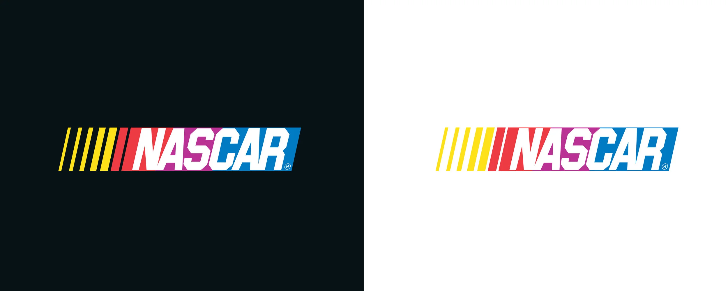
Nascar logo 1976-2017
The logo surprisingly held up pretty well for its age considering it had been virtually untouched since 1976!
The Nascar brand is one of those which fits the 'instantly recognisable' label perfectly. The 4 brand colours of yellow, red, purple and blue sum up the eclectic nature of oval stock car racing, as well as the italic diagonal block and lines which convey the speed and drama which occurs week in week out on track. All in all it was a logo that carried out its task admirably for over 40 years.
The task of progressing from such an iconic logo fell to Nascar's own in-house design team, who quite rightly decided that evolution was the best approach rather than revolution. The press release from Nascar describes their creative process:
"The NASCAR brand identity has been in development since early 2016 as part of a broader effort to refresh the NASCAR brand. It was designed to pay tribute to the storied history of NASCAR, incorporating elements of all four previous marks since the company’s inaugural season of 1948."
Nascar logo 2017-
The new logo is a much refined version of the original, the diagonal blocks have matured into a simple mark which complement the newly designed typeface perfectly. The type without a doubt I feel is the best part of the new brand, the two letter "A's" of the original logo never quite sat right to me and seemed to stick out compared to the angular nature of the other letters especially the "R" and "C"
Nascar logo 2017-
The greatest quality of the new typeface is that to many people at first glance there probably isn't much difference. Familiarity has been retained but progress has definitely been made design wise. One negative you could perhaps throw at the new logo is that via its new clean, slick image it has lost some of the chaotic character which was so evident previously.
My only real doubt about the Nascar logo is when it is teamed with new sponsor Monster Energy for the Cup Series branding. The Cup Series is the premier category of all of the Nascar series.
Monster Energy Nascar Cup Series logo 2017-
Obviously Monster have paid a lot of money to have their name in lights but I can't help but feel the treatment of the brands means the Nascar name is completely lost, especially with the addition of those green lines around it!
I'd be interested to hear any of your thoughts on the new brand!


