The Emperor's New Clothes
On the 30th January Stagecoach unveiled their new look which has been ‘shaped by customer research calling for a more simplified and modern service’. The updated brand features a new logo and 3 new livery variants which consist of “azure blue for local services, ocean green for specialist services and amber yellow for longer routes”. Quoting from the official press release “When conceiving the new bus design, Stagecoach asked thousands of customers to share their thoughts on how the new design could serve them best, and what would encourage them to use public transport more regularly.” According to Stagecoach’s research 69% of customers said they found it confusing to find the bus they wanted, with a further 37% stating they would use the bus more often if it was '“simpler and more modern”.
It is fair to see the new design has received pretty negative feedback from both the public and the industry since being released, and whilst it is easy to attack any large profile rebrand in the public sphere (something I would usually refrain from doing) but on this occasion I feel is warranted, not just from a purely aesthetic point of view but also the logic behind it and the launch itself.
Before delving into the design details I believe there are a number of flaws in the creative rationale, for example the main factor in the new 3 pronged approach is to make things simpler for a prospective customer. Stagecoach’s array of social media accounts are now telling customers that “The Azure Blue buses that you spot out and about are for Local bus services to help get you from A to B” This apparent simple new message is completely contradicted by the design itself, in reality the customer is looking for a bus that is blue and orange on the front, white and green on the side and orange on the back, quite why this doesn’t follow the same 1 colour design rule as the green version is unclear.
Moving on to the aforementioned ocean green variation of the livery, the official release claims “these are specialist services built for purpose – for drivers who need to park their car outside of town and use park and ride services, university students who need a lift to class and tourists who want to go sightseeing around the country”. The first thing that springs to mind is what do any of the 3 applications mentioned have in common? If the new design is intended to encourage new customers to use the bus I can’t understand how treating very different target audiences the same can achieve this. Furthermore the ultimate sin on an Enviro 200 MMC body has been committed by colouring the entirety of the front end in colour, not respecting the architecture and lines of the vehicle.
I also find it strange that Stagecoach would not wait to launch until they had also designed their new interior specification, but arguably the most bizarre part of the unveiling of the new design is the location and photography of the launch event. The photo below is the official launch image…
Surely a project of this magnitude would warrant properly composed photography which really puts the new design at the forefront. When similar nationwide operator First Group launched their new look in 2012 (example image below), professionally captured images were composed and edited to ensure the new design was the focal point of the imagery.
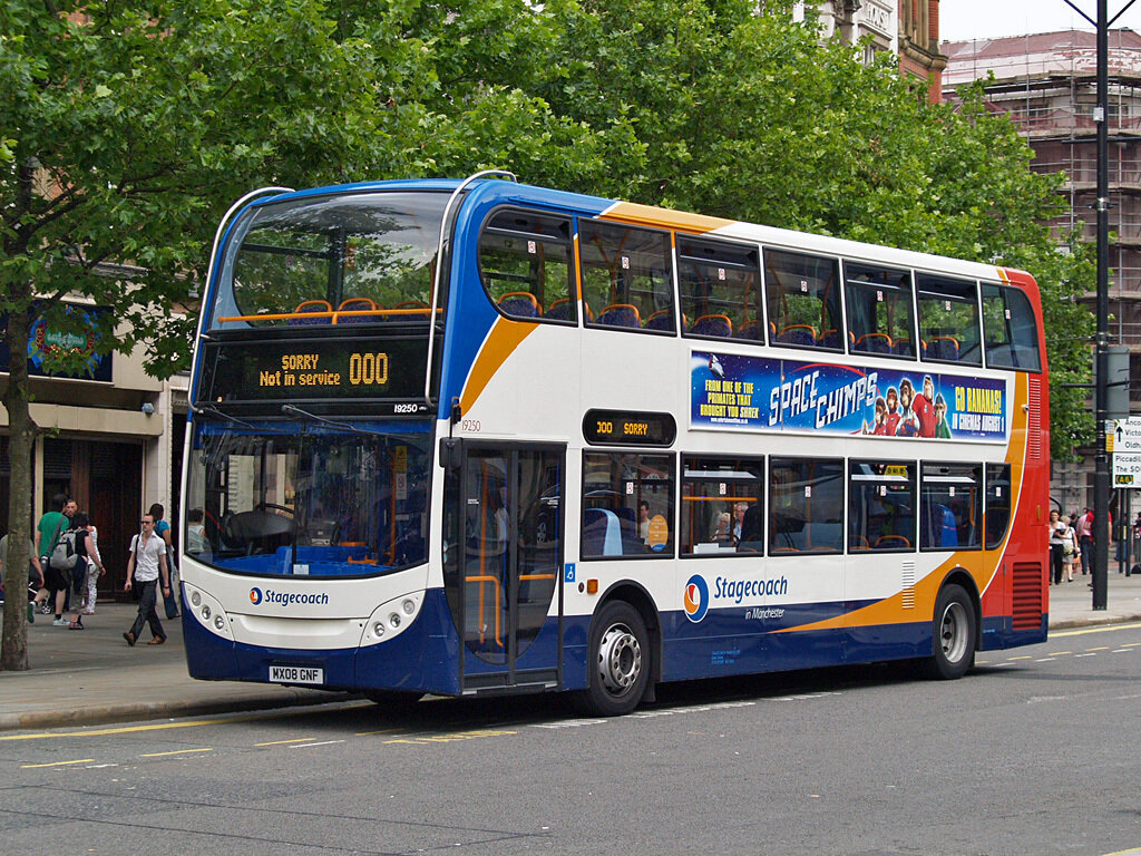
The livery itself seems to have been designed on specific vehicle types without a thought given on how this would be transferred to different body styles, hence the extremely unattractive orange bumper on the local variation of the livery which looks like a replacement part in the wrong colour. It is unclear who was behind the rebrand but I have heard on the grapevine it was an internal project. The previous Stagecoach ‘Beachball’ livery (below right) was designed by industry leaders Best Impressions, an example of how good design can stand the test of time having been originally launched in 2001.
Old vs new
Despite this it would be fair to say that the Stagecoach logo was starting to show its age, mainly in regards to the typography. Therefore the new sans serif wordmark is one area which is a positive step, it seems to be based on the TT Firs family with some subtle changes which for example give the ‘t’ a slight Trainline feel. My only real gripe is how closely spaced the icon is, it needs a little more room to breathe as currently it just feels too cramped. The icon itself is fairly inoffensive but does give off a slight Chrome/Firefox vibe but on the whole you can see the process that has delivered the final result. One area I would like to know more about is the decision to drop red from the colour palette, perhaps a visualisation of the company’s desired green credentials.
There aren’t many other examples of applications yet so we will have to wait and see how the brand is rolled out going forward, one nice touch is the loading GIF animation of the icon which has been added to the otherwise unchanged Stagecoach website.


