Extinct & Forever Forgotten
This design blog post is a bit different to most in that it is a celebration of British brands and companies that once graced every commute and journey, yet will never be remembered or thought about again. This is despite every member of the public of a certain age most likely encountering them at some stage in their lives.
A celebration of the unnoticed, normal and slightly bland yet I feel there is a certain romance to some of the names, logos and liveries that follow.
The following are in no particular order, just written as I could think of them.
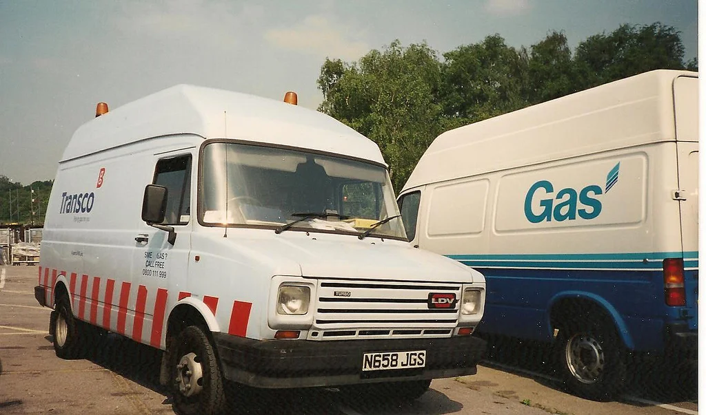
Transco. Who?? I hear you ask, Transco was the name for Britain's Gas infrastructure network originally a part of British Gas and in its form today simply known as National Grid. I believe this brand disappeared from British streets around 2003. I can remember seeing the company's light blue and red vans everywhere, I even had a toy one! I can also remember pit of the stomach fear as my football hurtled towards one of these vehicles parked up down my street. No Transco vans were harmed in the writing of this blogpost.
Transco van in 2001
Looking back now I find the brand really attractive, there is something about the base blue colour that is so unusual for a company of this kind. Think of any other utility company with a large fleet of vehicles, with the exception of British Gas, the chances are they are just plain white vans with some vinyls on them. The more I look back at images of the livery the more I want to reference it in a design in some way!
N reg LDV Transco van, note to the right the classic British Gas livery.
I also really like the typeface used for the company logo. It is bold and simple yet at the same time the slight tapering, especially on the letter C give it quite a friendly and approachable feel but still retains a corporate stance. The attractive blue and red colour scheme always reminded me of Spanish football team Celta Vigo. I wonder if Celta supporting Spaniards look at their kit and think of British gas distribution networks and infrastructure?
Next up, Lynx Express. I can remember always seeing Lynx lorries driving on the motorway with my dad and even years after their purchase by UPS seeing plain black trailers with a red stripe parked up in farmers fields with adverts on the side!
Lynx Express were the first real challengers from the private sector to the Royal Mail/Parcel Force monopoly, they kick started the express parcels/delivery industry that is thriving more than ever today in 2017 with our reliance on online order & delivery services. A precursor to companies such as DPD, Yodel, Interlink, CityLink etc. The parcel giant UPS purchased Lynx in 2005 for a reported £96.3 million, and with that the brand was no more.
The Lynx logo itself is so so cool and so so 1990s. I had never really appreciated or thought about it before until writing this. The speed and motion are spot on, combined with the stealthy colour scheme resulted in a really strong and clear brand image.
The logo is actually very similar in style and construction to a design classic, the British Rail created INTERCITY swallow logo of the late 80s.
I never actually realised the scale of the Lynx operation, while looking for photos of their lorries I found the picture below, the aircraft looks superb, especially that tail fin!
Lynx liveried Hawker Siddeley HS-748 pictured in 2004
I think once again similar to the Transco brand, the crucial thing that really captured my imagination was the use of colour. Its strange how things like this stick in your mind, and perhaps gives insight into why I ended up wanting to be a graphic designer. As even at the young age I would have been when the companies I have mentioned were still in full flight, I was noticing and more surprisingly remembering things like this, either that or I'm just a little bit weird.
A stealthy looking Lynx ERF
Continuing the delivery company theme, Securicor Omega Express. The parcels and delivery arm of security services company Securicor (Another lost brand itself?)
Thy key reason I can remember this company is through their prolific motor racing sponsorship, especially in the British Touring Car Championship. In turn this then made me notice their vehicles on the everyday roads.
Will Hoy on the way to the 1991 BTCC title in his Omega Express BMW
Omega Express sponsored arguably the most famous touring car of all time, the classic Volvo 850 estate driven by Rickard Rydell and Jan Lammers. The first time an estate car had ever been raced in a professional series which proved to be a huge marketing success for Volvo.
Jan Lammers piloting the 850 estate in '94
Omega's vehicles themselves were also hard to miss, the light blue colour forming an allover bold livery. Omega is the last letter of the Greek alphabet, the company logo is simply the written form of this letter 'Ω' in a circle which translates in English to the letter 'O', possibly giving meaning to the circle which could be representing the O. Although quite what any of this has to do with delivering parcels I don't know! At least with Lynx there are the obvious connotations of speed.
Omega Transit Mk3
T Reg Volvo rigid in Omega colours
That's enough forgotten British brands for one sitting, If you've made it this far you've obviously got far too much time on your hands as do I writing this. I've thought of about 4 more similar brands which I'll post about in a couple of weeks time. If you think of any comment below!


